Fresh EBT by Propel
Fresh EBT is a free mobile app that I focus on at Propel. The app is used by 2+ million low-income Americans nationwide to make it easier for them to manage their SNAP (food stamp) and TANF (cash welfare) benefits as well as get access to additional resources.
The Challenge
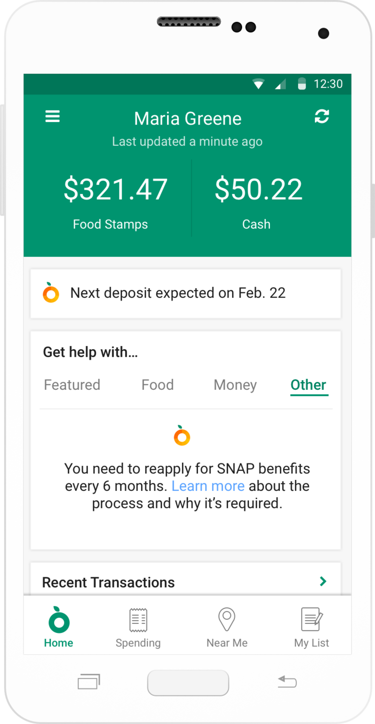
Fresh EBT had existed for 2 years with very little change to the core pages of the app. The app’s simplicity is critical for accessibility to a diverse user base, but its simplicity created lack of clarity as we added more content and resources.
Main issues:
Too much content without enough organization
Users were emailing us saying they couldn’t find a previous offer they had seen on the homepage
We were struggling to understand the scope of what we were offering users at any point in time
Duplicative navigation — both bottom bar and hamburger navigation
We wanted to be more than “just a balance checking app”
Team members
Jeff Kaiser
Ram Mehta
How do we organize content so it makes sense to us, to users, and to our partners?
How do we show the variety of resources available inside Fresh EBT — in addition to their balances?
Aside from card balance, what information is the most important to users? How do we display offers in an effective way?
The Results
10% increase in overall engagement in all app features
30% increase in content engagement